Site evolution: the bank's front door, step by step
What this is
Two very different ideas of what a bank's first screen should say.
The public site is the first thing a business sees before it opens an account — often before it has spoken to anyone at the bank. Over four years it was rebuilt several times, and not every rebuild was about looks. Some versions changed the style and kept the story; one changed the story itself and stopped describing a mission to show the product.
Laid side by side at the same width, the versions make the difference visible: when the site changed its style, and when it changed its job.
6,153 px
3,213 px
5,399 px
8,050 px
6,250 px
5,131 px
Line A: one manifesto, two styles
From 2022 to early 2025 the site told the same story in the same order: discover, banking is the mission, borderless is the vision, designed for the digital age, premium, secure by design, grow your global footprint, and a final call to open an account. The skeleton matches section for section. What changed was the voice: dark 3D art gave way to a light interface language. That was an argument as much as a taste — the heavy 3D slowed the pages down, and after a long back-and-forth with the front-end team we agreed to cut graphical weight for speed.
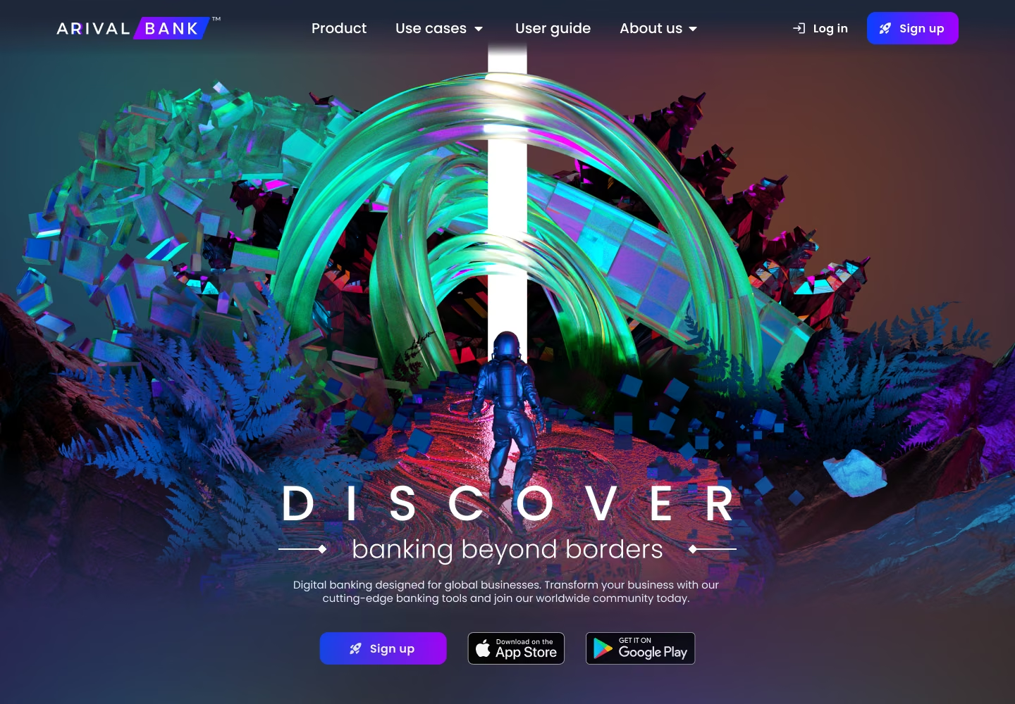
Redesign edition
By late 2024 the site had fallen behind the bank. The product had just been redesigned, and the dark 3D art made us look more like a crypto exchange than a serious bank. This edition kept the manifesto but swapped the art for product: a stricter grid, crisper type and lighter pages that load faster.
The work covered the main page, the business and individual product pages, a simplified pricing page, and early drafts of careers and FAQ.
Take it wavy or easy?
Early 2025 tried the opposite move: keep the content, add motion. Shader backgrounds carried the mood the 3D art used to carry, at a fraction of the weight. It did go live, for about three months. Stakeholders found it too complex and too dark: the heavy, layered plates pressed on the content instead of framing it. That reaction set the brief for what came next — lighter, flatter, product first.
Every shader in these cases is mine, made in Unicorn Studio —
and so is the motion across these cases, made in Jitter.
I'm an official expert in both tools. Some examples.
Break A:
the site becomes the product
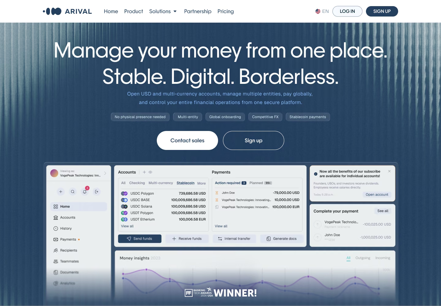
In late 2025 the first screen stopped describing a mission and started showing the product: the app itself in the hero, the headline "Manage your money from one place", then stablecoins, pricing, use cases, the customer journey in five steps and the mobile app.
The page grew from about 5,400 to 8,050 pixels, and all of the growth is product content. That was a positioning decision as much as a design one, and it is also why the redesigned platform from the first case now sits in the site's first screen.
Break B:
one product, several art directions
With the content settled, we explored how the same product story should look. The directions share the same blocks — the headline, one card for fiat and crypto, stablecoin payments, the customer journey, licensing, the app — and differ only in treatment.
One of them, a dark striped hero with coloured glass textures, I took all the way to a working build myself — coded end to end with Claude Code, directed through Design Brain, the design harness I built — so the direction could be judged in a browser, not in a static frame.
Where it is now: three live entry points, A/B tested
While we were building the white-label system, we also decided to try more local versions of the site — pages tuned to a specific audience instead of one page for everyone. That work led to the current versions and the A/B tests around them.
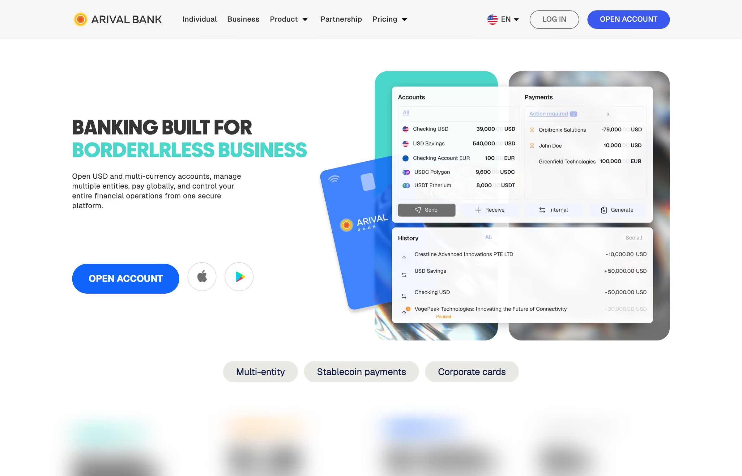
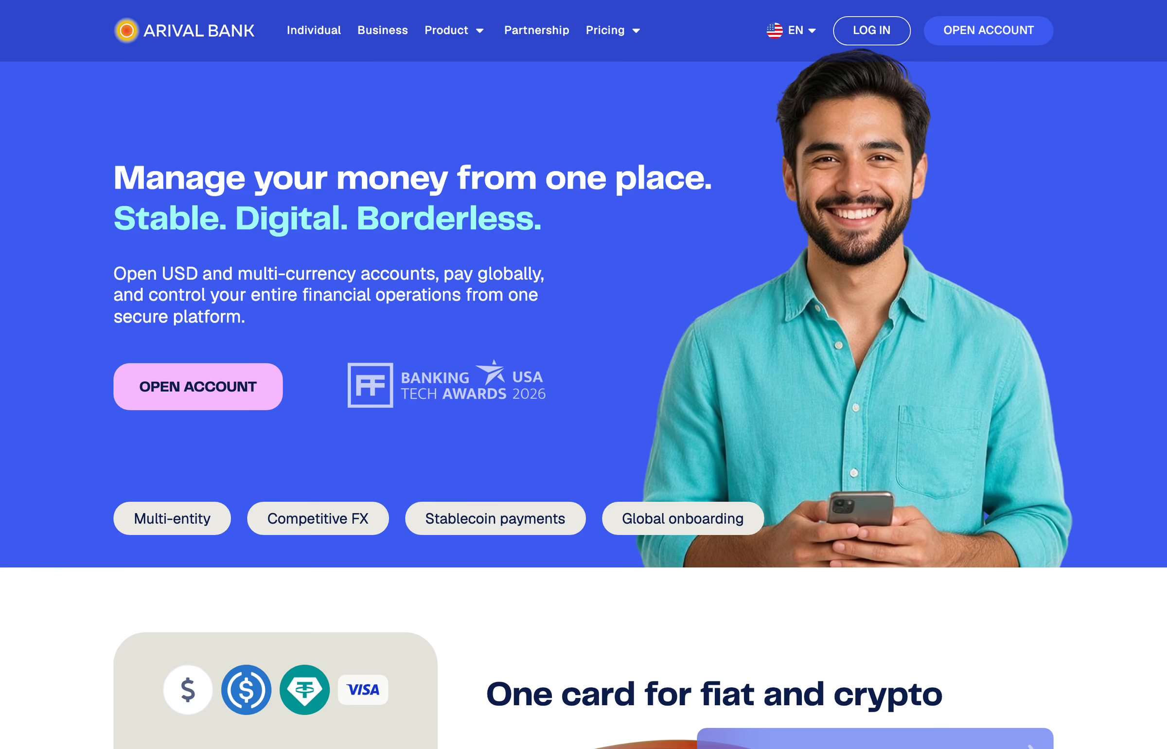
The live site now runs three entry points: a root page that splits into "for all" and "for business", a business page and an individual page. It is an experiment, measured with A/B tests: a deliberately more mature, conservative presentation aimed at an older audience, to see whether it converts better than the lighter product pages.
In parallel, the business site is being rebuilt as a system — a local component library for the marketing surface and five breakpoints designed explicitly, so a new page is assembled from parts instead of drawn from scratch.
What else changed
In 2026 we also replaced the logo and settled the identity across the site, the apps and the back office. Among other reasons, the old mark looked a little too much like a certain London fintech. Given who's reading this, it felt polite to mention.
Who built the new versions
For the latest versions of the site Vladimir Belyakov joined my team, and the site was his entry project. He already knew the bank from the inside: as a designer at Arival he drew the very first version of the product interface and the zero version of the site, before the design function existed. The new versions he designed under my direction and side by side with me — I designed the additional options, built the UI kit the pages are assembled from, and worked through the responsive versions with him.
What I take from it
Style changes are cheap to see and easy to argue about. The change that mattered was structural: the moment the site stopped telling a story about the bank and started showing the bank's product.
Everything after that — the art directions, the live A/B test, the component library — is about making that product story fast to change and cheap to test.
If I had to keep one rule from all these versions, it's this: stop arguing about how the front door looks until you agree on what it's for. Every version that changed its job moved the business. The ones that only changed their style moved the discussion.